Easily Map Your QSOs
Free online tools to map your contacts and make the image web friendly
Those nice maps you sometimes see online? You know the ones: place markers and path lines that show your amateur radio QSOs. Here is an easy way to make your own: Log Analyzer 3.2.
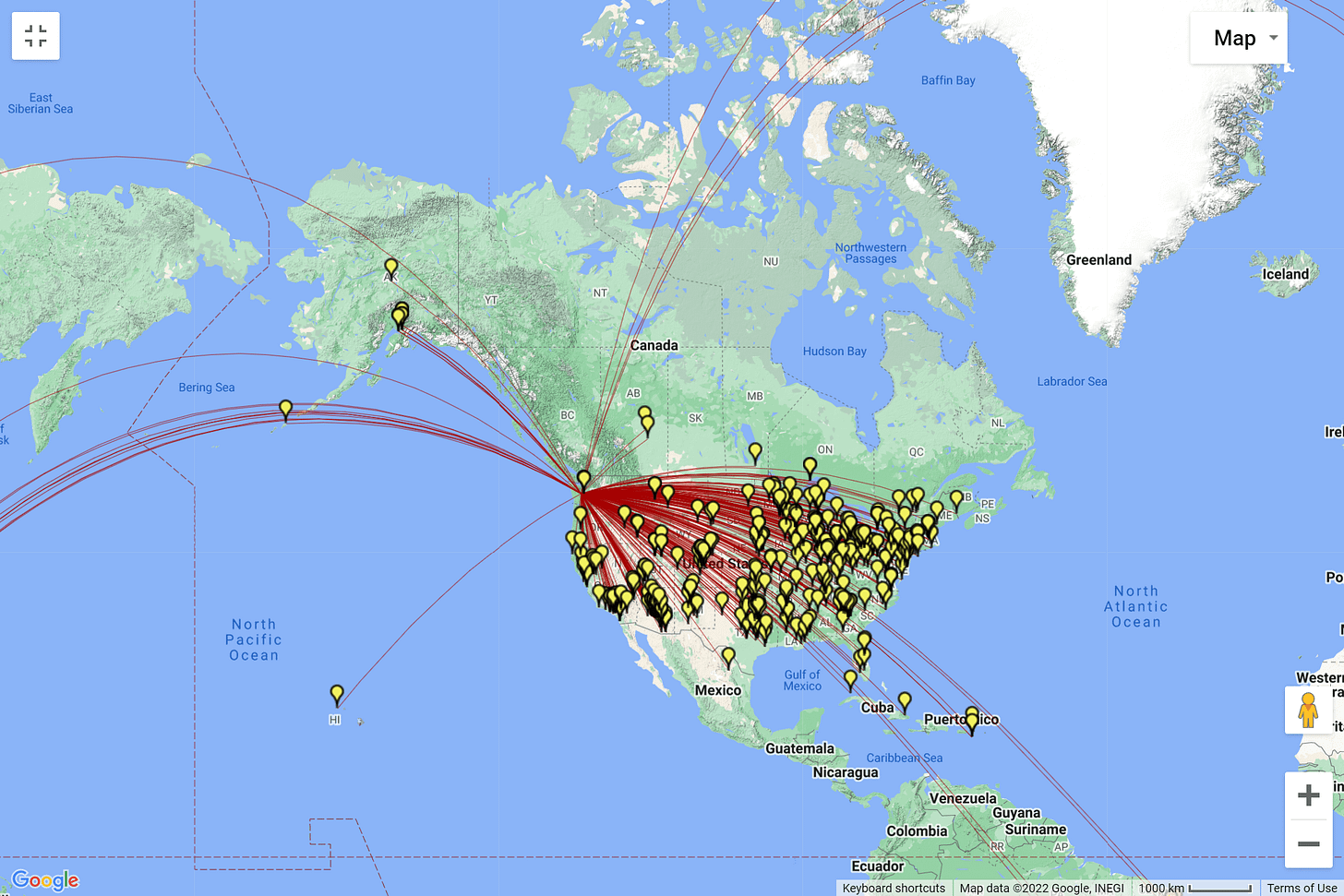
But let’s cut to the chase by starting with what the QSO map looks like. Here is my QSO map for August 2022, produced by importing the ADIF file I exported from my QRZ logbook.
Once imported into the Log Analyzer tool, selections allow you to show how the location markers are shown, how to show the path lines, etc.
Saving the image is easy: expand it to full screen and then take a screenshot. On my computer, that produces a PNG image file. The original file for the above image is 1.91 Mb in size. That is pretty large for a web post. I reduced it with one of my favorite tools: the online image optimizer by Optimizilla. Running the large image through that optimizer reduced the file size to 631 Kb, making it much more friendly for web posting.
There you have it — a nice way to visualize your amateur radio contacts by importing your log file, saving the image, and squishing it to make it more web friendly.
If you prefer to map more directly within the Google ecosystem, you’ll need to convert your ADIF file to something Google can digest. I suggest using the ADIF to KML converter by Joshua Carroll. Upload your ADIF file and once it is imported, export the KML file to your computer. The go to My Maps in your Google account and import the KML file. That’s it. Click the link to see how my August 2022 ADIF file looks as mapped by Google: https://www.google.com/maps/d/u/0/edit?mid=1g85SW3jhX9hqN5dSqaI91Uwcg4XZDwk&usp=sharing


Or this site/service: https://qsomap.org/